How to design accessible forms in 10 steps
Digital • May 08, 2024 • Written by: Bethan Phillimore • Read time: 8 min

This article has been written by Bethan Phillimore, UX Designer at Methods, and was first published in UX Collective
While completing a form isn’t usually a particularly fun task for a user, it is often a necessary step of a process. For example, a user might be asked to fill out a short form with payment details to buy an item or they might have to complete a form as part of a job application.
As a designer, we can make the lives of our users easier by designing forms to be straightforward to complete and accessible to all. Ensuring all users can access and understand elements of the form (for example, users of assistive technologies) benefits both the user and the business the designer might be working for. For instance, if a user with access needs can’t complete the payment steps due to the form not being accessible to them, not only is it frustrating for the user, it also negatively impacts the business they’re trying to buy from.
Here are some practical tips on how to design accessible forms:
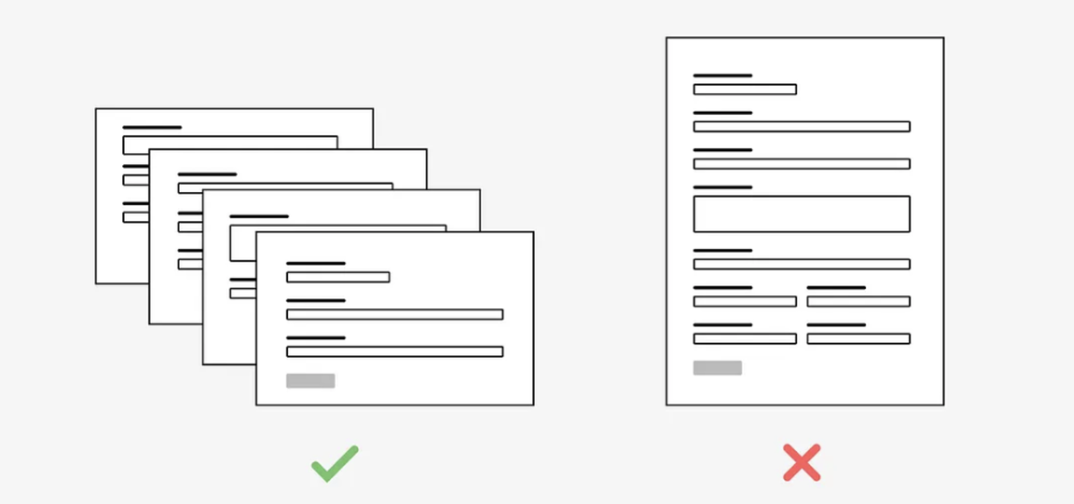
1. Break long forms into shorter, multi-page forms
Avoid designing long forms with many fields on the same page. Instead, try to divide the fields between multiple, shorter forms. Long forms can be daunting and more difficult to understand, particularly for those with lower digital literacy and for some people with cognitive disabilities such as ADHD (Attention Deficit Hyperactivity Disorder). Aim to reduce the cognitive load by grouping together related fields in a logical way.
Once broken into multiple pages, ensure any instructions appear on every page. This prevents the user from having to rely on their memory to remember the form instructions, which would be difficult for most people, and even more difficult for someone with a cognitive impairment which affects memory.
Remember that adding multiple form pages can also make it more difficult for a user to understand how far along they are with completing the form so it’s often helpful to visualise progress in some way.
2. Top align labels for input fields
Visual labels tell users what the corresponding input fields mean and helps them fill out the form. Using visual labels also ensures that screen readers can identify the input field. For the screen reader to be able to associate the label with the input field, set the identifier in the <input> to correspond with the for attribute of the <label>. It’s best not to nest <input> inside of <label> as some assistive technologies won’t support it. ARIA labels (aria-labelledby and aria-label) may be used when it is not possible to use <label>.
Positioning the visual label above the input field is generally best, as users aren’t forced to look separately at the label and the input field. For visually impaired users who use zoom, positioning the labels above the input field means they won’t have to horizontally scroll across the page to complete every form field Label form elements correctly, both in the code and visually on the page
3. Use hint text, not placeholder text
Placeholder text inside the form input is intended to be helpful to users, but often invites a number of usability and accessibility issues. Placeholder text usually disappears once the information has been entered into a field, making it more difficult for a user to remember the hint and to make a correction as it relies on their memory.
The placeholder text might also be completely inaccessible to some users. For example, placeholder text is not broadly supported across assistive technologies and not displayed in older web browsers. In addition, the default colour used is a pale grey, meaning it has poor colour contrast against most background colours and therefore making it more difficult (or impossible) to read for users with low vision.
Instead of placeholder text, try using hint text either above or below the input field to provide help or additional information. This text will always be visible and therefore is more likely going to be recognised by assistive technologies.

Use hint text to provide additional information
4. Use native form controls
Using native HTML helps your code function better for many users because native code is more likely to work on multiple browsers and with different types of assistive technology, such as screen readers. Native HTML elements are accessible by default, so by using native HTML form controls, you’re on your way to ensuring assistive technologies can fully access the form you’re designing.
If you do need to create custom form controls, use WAI-ARIA techniques to manually add attributes. Ensure to manually test any custom form controls to ensure they are accessible to screen readers and by keyboard alone.
5. Highlight elements on focus
For a user who uses only a keyboard to navigate through websites, being able to clearly highlight focus areas enables them to navigate through the form with ease.
Clearly highlight <input> on focus and ensure the colour chosen to highlight, has sufficient colour contrast against the background colour.

Clearly highlight any form inputs on focus
6. Style and write errors correctly
When a user encounters an error with a field on the form they need to be able to determine what is wrong and how to fix it. This applies to users with and without access needs. However, poorly styled or written errors can make it impossible for some users with access needs to understand and fix the error.
Styling
When presented with an error, typically the input border colour is changed to red. This alone isn’t an accessible way of handling errors for two reasons. Firstly, the colour change won’t be obvious for people who are colourblind and secondly, a colour change won’t be exposed to assistive technologies. A symbol might help indicate that there is an error but it won’t help users understand why the field is invalid. Accompanying text to clearly indicate what the issue is considered the most accessible method of highlighting errors to a user.
Content
It’s important to write error messages in plain English and avoid technical jargon to ensure the error is easy to understand. The message should provide appropriate suggestions for how the user might fix the error.
To help screen readers understand that a field is invalid, use the ARIA attribute aria-invalid="true”. This attribute causes screen readers to identify the control as being “invalid” or in need of attention. To associate any inline errors with form fields, use aria-describedby.

7. Label related fields in a group
Sometimes a form will be made up of related field elements. For instance, a few different elements might make up an address input or a radio button might have multiple options. For these situations, properly labelling the group of related fields will ensure a screen reader can identify the relationship of the fields.
Fieldset and legend can be used for this purpose. The legend can be used as the label for the group, usually the question being asked, enabling the screen reader to hear both the label for the field and for the group. The fieldset is used for grouping the form controls together.

Use <fieldset> and <legend> to group related fields
8. Provide instructions
Before the user starts the form, it’s often helpful to give some contextual information. For example, it could explain whether the user needs anything to complete the form or if there are time limits. These instructions should appear before the <form> element to ensure that it is read aloud by screen readers.
In-line instructions can help a user identify which fields are required and what format to complete the field in. To ensure any instructions are visible to screen reader users, use the aria-describedby attribute. If the instructions aren’t bound to the form fields then some assistive technologies might miss the information completely.
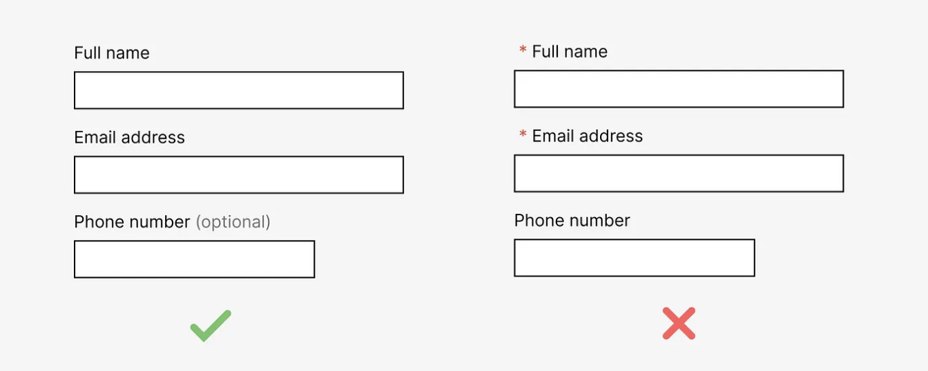
9. Clearly identify any required fields
Any required fields on a form need to be clearly identified. This could be through showing which fields are required or which fields are optional, depending on fewest occurrences.
A required attribute can be added to form controls to programatically indicate that the form field is required. If the web browser supports HTML5, the form cannot be submitted without the field being completed. Using the aria-required attribute can be used to inform assistive technologies about any required controls so they announce to the user. Most browsers which support HTML5 will automatically set the value to true when the HTML5 required attribute is present, however including aria-required ensures older web browsers are also supported.

10. Where possible, avoid time limits for users to complete forms
Many users with access needs will require more time to complete a form. For example, a user who is blind or partially sighted will likely need more time to find and read information on the page and may not see a timeout warning message. A user has a cognitive or learning disability may require more time to read and understand the content of the form. A user with hearing impairments might require more time to process auditory information or understand when English might not be their primary way of communicating (e.g. non-English speakers or sign language users).
If a time limit is necessary (e.g. for security reasons), the user should have the option to turn it off or extend the time limit. The user should be informed of the timeout and what the timeout limit is as the start of the form.
Wrap up
There we have it — those are my tips for designing accessible forms. I hope the points can help you ensure all users can use your form. Remember, this ultimately benefits both the user and the business, so there’s really no excuse!